


SEASON 2
Episode 4 / Mrs Eaves
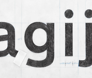
Mrs Eaves, Suzanna Licko, and the Problem with Design History. Mrs Eaves is a typeface you’ve almost certainly seen before—on book covers, in publishing, and across graphic design—but may not be able to name.
In this episode, we explore the history of Mrs Eaves, the influential typeface designed by Suzanna Licko, and why credit in design history is so often partial, complicated, and contested—especially when women are involved.
Suzanna Licko is one of the most important figures in contemporary type design, yet discussions of her work are frequently oversimplified. While Mrs Eaves is widely used and recognised, its story reveals deeper issues around authorship, visibility, and how design history gets written.
Why Design History Can’t Always Be Trusted. Anitra did the research for this episode and teaches you how to enthusiasm, side-eye, and a healthy distrust of received design narratives—shaped in part by having gone to design school alongside private school boys and seeing firsthand how authority and confidence are often mistaken for expertise. This personal context opens up a broader conversation about why design history, typography history, and graphic design education are often unreliable or incomplete.
From 18th-Century Print Shops to the Legibility Wars. During this episode, we take several detours, including: The HR relations of early 18th-century print shops, the role of trade magazines in shaping design discourse, the so-called legibility wars of the early 1990s and what they reveal about taste, technology, and power.
These moments help situate Mrs Eaves within a much longer history of printing, publishing, and typographic debate.
Learn to Spot Type in the Wild. By the end of the episode, you’ll not only have a deeper understanding of Mrs Eaves and Suzanna Licko’s contribution to type design—you’ll also be better equipped to recognise typefaces in everyday life. You can use the images here to dominate bookstores with your new favourite game: guess that book cover typeface.
Topics Covered in this episode:
-
Mrs Eaves typeface
-
Suzanna Licko
-
Typography and type design
-
Design history and authorship
-
Women in graphic design
-
Printing and publishing history
-
The legibility wars
Links to stuff we promised to put in the show notes:
Mrs Eaves font specimen, includes the lovely ligatures and non-lining figures:
https://www.emigre.com/PDF/MrsEaves.pdf
David Carson and Raygun Magazine:
https://www.davidcarsondesign.com/t/tag/raygun/
Emergency Episode:
Welcome to the resistance Calibri!
Season 2 / Episode 3
Ripped straight from the headlines of late 2025.
When Calibri was unceremoniously replaced by Times New Roman under the Trump administration, we chose to process our feelings—potential travel ban be damned.
Yes, this episode is about fonts. And no, it’s really not.
In a looser, more unscripted conversation than usual, we turn rage into humour while exposing how typography has always been political: shaping authority, enforcing norms, and quietly excluding people.
Typefaces, it turns out, have never been neutral.


SEASON 2
Episode 2 / Transport
Transport, Margaret Calvert, and the typeface that isn’t a typeface. In this episode, we examine Transport, the British road signage system developed by Margaret Calvert with Jock Kinneir, and how it is “not actually a typeface”. Transport wasn’t designed to express personality or taste. It was designed to work, at speed, for everyone. It lives on motorways and road signs, doing its job so efficiently that noticing it usually means something has gone wrong.
Margaret Calvert and Professional Seriousness. Margaret Calvert built her career in a design world dominated by men. Her response was neither charm nor compliance but competence. Calvert insisted on the validity of her ideas, avoided being cast into secretarial roles, and earned authority through her work. This work on British road pictograms helped define a visual language that is now so familiar it feels inevitable.
Pictograms, Haircuts, and Cultural Permanence. The deer crossing, farm animal warnings, and the children crossing sign are not neutral symbols. They were drawn, tested, argued over, and eventually absorbed into everyday life. Calvert immortalised herself, complete with bob haircut in the children crossing sign.
Transport has since spread well beyond Britain, influencing signage systems across Europe, Asia, and the Middle East. Its success lies not in originality, but in disciplined consistency.
The Typography Wars (Lowercase vs. Shouting). The introduction of the new motorway signs in 1958 triggered what can only be described as a typographic moral panic. Letter-cutter David Kindersley argued for all-caps serif lettering, claiming elegance, efficiency, and tradition. Kinneir and Calvert argued that drivers don’t read letter by letter, and that word shape—ascenders, descenders, and mixed case—matters at speed.
The debate played out in newspapers, committee rooms, and eventually a legibility “experiment” involving airmen, mock signage, and results so inconclusive they barely deserve the name science. Modernism won anyway.
Legibility, Speed, and Guesswork. Transport was developed to solve a new problem: how to communicate clearly to people moving faster than designers had ever had to account for. Some of the assumptions behind it have not aged particularly well, but the seriousness of the attempt still matters. This was design as infrastructure, not decoration.
More Than a One-Job Alphabet. Despite its deep association with roads, Transport is restrained, neutral without being empty. Margaret Calvert has suggested that she and Jock Kinneir never set out to rebrand Britain with Transport. Nevertheless, they did—quietly, efficiently, and with very little interest in being thanked.
Topics covered in this episode:
-
Transport lettering system
-
Margaret Calvert
-
Jock Kinneir
-
Road signage and wayfinding
-
Legibility and speed
-
Design systems
-
Women in graphic design
-
Typography wars
-
Public infrastructure design


SEASON 2
Episode 1 / Akzidenz Grotesk
Originally Anitra thought this typeface was designed by a woman, and because she is the only person authorized to speak about typefaces designed by a woman Anitra did the research for this episode. Sure, Jason is in touch with his feminine side, but not enough to be brave enough to speak (and he is too young and pretty to be canceled).
Turns out Anitra was almost completely wrong, this typeface was created by a bunch of women — maybe. Although kind of no one designed this typeface too? Anyway, it wasn’t what we expected, but Anitra claims she is still right about who designed it, but in an unexpected way, and Jason is not contesting this.
Emergency election pod:
‘The Balto conspiracy?’
Inger gathered the team for an emergency pod about Balto the 2013 typeface chosen for the Harris Waltz campaign.
After one failed attempt — which tested Inger’s patience about kerning — we nailed it (although we may inadvertently start some new political conspiracy theories by talking about the adventures of a plucky Disney dog also named Balto, not to mention the problematic choice of Perpetua for Obama’s first campaign).
Anitra talks too much about columns and typeface rubbings and Jason tries to take the higher ground, while Inger briskly moves us along. We then revisit past presidential campaign typeface choices, and argue about Optima. Finally we add to Trump’s growing list of indictments by pointing out he has also committed type crimes.
Stuff we mentioned in the episode:
Making Balto
The new Trump Logo and the MAGA cap story
McCain's Optima typeface story


Episode 6 / Goudy
In the last episode of Season 1 we finally tackle our least favourite typeface, Goudy. We learn about the designer, Frederic (no K) Goudy and speculate on his rumoured penchant for women and fast cars. We dive into his improbably large output... of typefaces and publications. We wonder if part of the reason he designed over 100 typefaces was his very talented wife Bertha, who got much less press despite once being named the Times ‘Woman Printer of the Year’. So we put a picture of her up here as well.
Jason did the history of the typeface for this episode. He offered to revisit our Oxford University Press days because he has spent less time in therapy about it than Anitra. It becomes clear by the end of this episode that he is in a much better place about Goudy, as well as his ex-boyfriends.
This episode is for all survivors of corporate typefaces, whatever they were. #wehategoudy #forever


Episode 5 / Baskerville
In this episode we talk about Baskerville, which is the most trustworthy typeface (as proven by science.)
Anitra has feminist thoughts about designer John Baskerville and thought it would be inappropriate for Jason to mansplain this particular typeface to her… but she found out some things about JB and, well, this episode takes a turn.
We learn about how designer John Baskerville pissed off the establishment enough to be turned into a famous book character, was a bit of a chav, and perhaps even inspired a riot years after his death.
In fact what happened to Baskerville after he died is possibly even more interesting than why he got dismissed by the Vox Classification system. And it’s not often you can say that in a sentence.


Episode 4 / Times New Roman
In this episode we examine the history of that most ubiquitous of typefaces, Times New Roman, which is much more interesting than Times New Roman itself, honest.
We learn about Stanley Morrison and his views on ‘typographic discipline’ and how he convinced a major newspaper to make a whole new typeface because he considered theirs ‘sloppy’. We long for this kind of power.
Anitra volunteered to do the typeface history for this episode so she can then bore for Australia on printing technology. Jason tries to stay awake.
Because we had to re-record this four times we talked our designer friend David into sticking around after recording the Bodoni episode and helping us record this episode one more time. It turned out better once he helped us — thanks David!


Episode 3 / Bodoni > Listen here
After a much longer than intended “we’re out of lockdown and we have a social life again!” pause The Type Pod is back! In this episode we deep dive into Bodoni, that typeface most beloved by designers of fashion magazines.
Designer, type teacher, and Anitra’s former student David joins us from Washington D.C. to discuss why designers have, for more than two centuries, stuck with Bodoni through thick and thin.
We learn all about designer Giovanni Battista, who once made Napoleon come to his house for a change, and is special enough to have his own museum in Parma. We speculate on why grunge band Nirvana chose a typeface most associated with “high class” to be their band logo.
Finally, Anitra will explain why Bodoni probably wouldn’t get sloppy ‘white girl’ drunk.


Episode 2 / Gill Sans > Listen Here
Due to technical issues during recording, we skip our advertised feature on Times New Roman; although fear not, we will return to Times New Roman in the future. Instead we focus on Gill Sans, and Eric Gill, type designer and religious artist, with a sideline in erotic woodcuts.
Jason warns that luxuriant facial hair combined with smock-wearing are a red flag, and Anitra confesses disturbing revelations mean she is no longer a fan of Gill Sans or Chris Pratt. We agree that Gill Sans is not a typeface for beginners, and discuss the hazards of uneven proportions in letterforms. Anitra laments that saying Gill Sans is the “British Helvetica” doesn’t wash with Americans.
Weblinks referenced in this episode:
The Four Gospels
https://www.foliosociety.com/au/four-gospels.html
The Gill Sans Font Family (scroll down for Gill Sans Ultra Bold)
https://www.fonts.com/font/monotype/gill-sans


Episode 1 / Futura
In this first episode we talk about Futura, that most versatile of modernist typefaces and its designer Paul Renner, the OG Anti-fa.
Anitra tells Jason why the Nazis hated Latin typefaces. We argue about the merits of mathematical proportions and Jason unfairly compares Type Designer Mathew Carter to a character from Game of Thrones.
Websites and books referenced in this episode:
Biography of Renner:
https://mantex.co.uk/paul-renner-the-art-of-typography/
University of Kansas Bio of Renner (that everyone else shamelessly ripped off):
https://people.ku.edu/~delange/paulrenner.html
About the women of the Bauhaus:
http://www.designcurial.com/news/the-women-of-the-bauhaus-7370218
Getty Research Institute:
https://www.getty.edu/research/exhibitions_events/exhibitions/bauhaus/new_artist/history/principles_curriculum/
Just My Type / Simon Garfield
Elements of Typographic Style / Robert Bringhurst
Download a transcript set in Futura